A Re-Branding Case Study
Visual Identity
|
Website
|
Social media
|
Illustration
|
animation
|
Client
Challenge
Tachles – A Breathing Space
“Tachles” is a nonprofit organization that connects single-parent families with volunteers, who come once a week to spend time with the children. This gives parents a few precious hours to take care of errands, activities, or simply enjoy a quiet coffee with a friend.
The organization had an existing visual identity, that felt cluttered, and somewhat heavy. My goal was to redesign their brand language to feel warm, welcoming, and community-driven, while also visually reflecting the idea of “breathing space.”
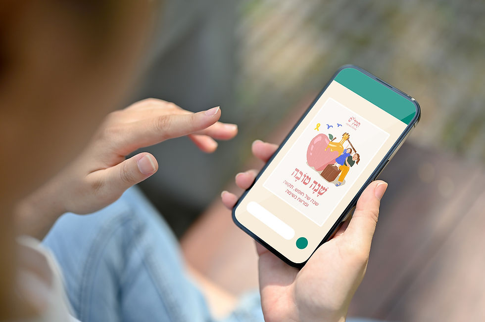
In addition, I developed a consistent digital presence for social media: posts, stories, highlights, and a Facebook cover.
Previous Design

Previous logo
Previous website
The pain points of the existing visual identity and website, that I have identified, were:
-
Visual clutters dew to heavy-handed color palette and weak typographic hierarchy.
-
Inconsistent illustration style and visual assets.
-
The website was hard to scan and as a result, the brand struggled to communicate its core values of community, volunteerism and “breathing space”, for its target audience of volunteers and single parents, as well as donors for this non-prophet organization.

New Look

New logo
Balance of Tradition and modernity
The Hebrew script roots the logo in the Yiddish origin of the word “Tachles”, while the execution keeps it engaging. The punctuation of the letters forms a link to the world of children, who form the heart of the association.
Symbolic Detail
The bird-like flourish above the letters suggests freedom, lightness, and breathing space, reinforcing the organization’s mission of providing relief and support.
Tagline Integration
The clean, simple font of the tagline contrasts the expressive logotype, ensuring clarity and readability while strengthening the brand’s message.


Typography

Yiddishkeit FM
A Hebrew script serif typeface with irregular letterforms and expressive look. The font balances cultural reference with a contemporary aproach.
א
Regular
-
Logo Subtitle
-
Text typeface
א
Medium
-
Text titles
Fredoka
A rounded sans-serif with soft curves and clean geometric forms.


Original animated illustrations


Website


Social Media