
E-commerce
|
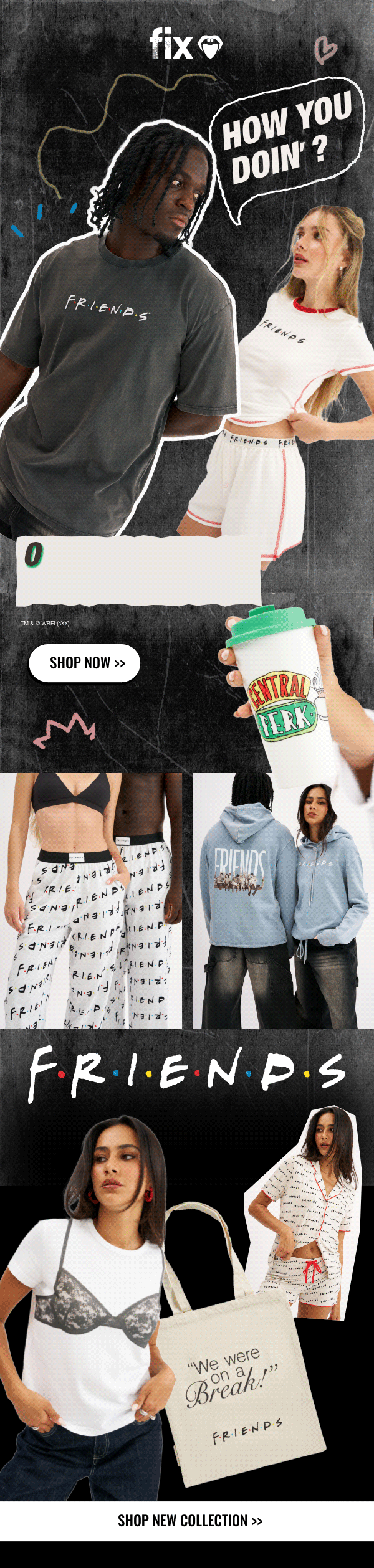
Social Media
|
Newsletters
Client
My Role
fix
-
E-commerce Experience: Marketing-driven UI and web assets designed to convert.
-
Social-First Content: Animated Instagram and TikTok assets tailored for high engagement.
-
Retention Marketing: Stylized newsletters that balance editorial aesthetics with clear conversion goals.
Design Adaptability in a Trend-Driven World
In the fast-paced world of Gen Z loungewear and intimates, my role as a Marketing Designer, is maintaining a recognizable brand DNA while constantly reinventing the visual language to align with the latest digital trends.


Since joining the team, I have challenged myself to To lead forward the brand aesthetic while preserving the playful and accessible "vibe" that our community loves.


In addition, I integrate a lot of motion graphics and animation into our core marketing assets. Adding movement has transformed our static campaigns into dynamic experiences that capture attention and drive engagement.

Every campaign is a new playground. I lean into diverse techniques - ranging from experimental typography to urban-inspired collages - ensuring the brand always feels "now."

Focus on:
VIDEO ARCADE CAMPAGNE

From “lookbook” photos to a campagne creative

1
We started by choosing a few items from the collection to lead the campaign.
2
We then gathered references for each item and chose a motif that would lead the world we would create for it.
3
We used AI to simulate the photographic style we wanted, including the use of a wide or fisheye lens, the positions and attitudes of the models.
4
Then, we created sketches that would simulate the final outcome.
5
We were present on the day of the photo shoot to guide the models and the photographer and ensure that the results were close to what we wanted.
The prep
The Result


Focus on:
PERIOD PANTIES
A graphic packaging language I designed for fix’s period underwear line, tailored to a Gen Z audience. The visual system combines bold color blocks, illustrations, and icons, with a confident use of pink and red to openly embrace menstruation. The result is a playful, trend-driven design that reflects the brand’s youthful identity while aligning with values of openness and sustainability.


Focus on:
AI CREATIVES
AI has become an integral part of my design process. As the technology evolves, I continuously explore more thoughtful and advanced ways to integrate it — not as a shortcut, but as a creative tool that enriches concepts, expands visual possibilities, and helps optimize budgets without compromising quality.


From “lookbook” photos

To a campaign creative


#fixSALE
Designing sale creatives for fix requires a balance between freshness and consistency. Each campaign introduces a new visual idea to re-engage the audience, while remaining coherent through a fixed color palette and bold, high-impact typography.

