Visual Identity
|
Packaging
|
Illustration
|
animation
Client
Challenge
Solution
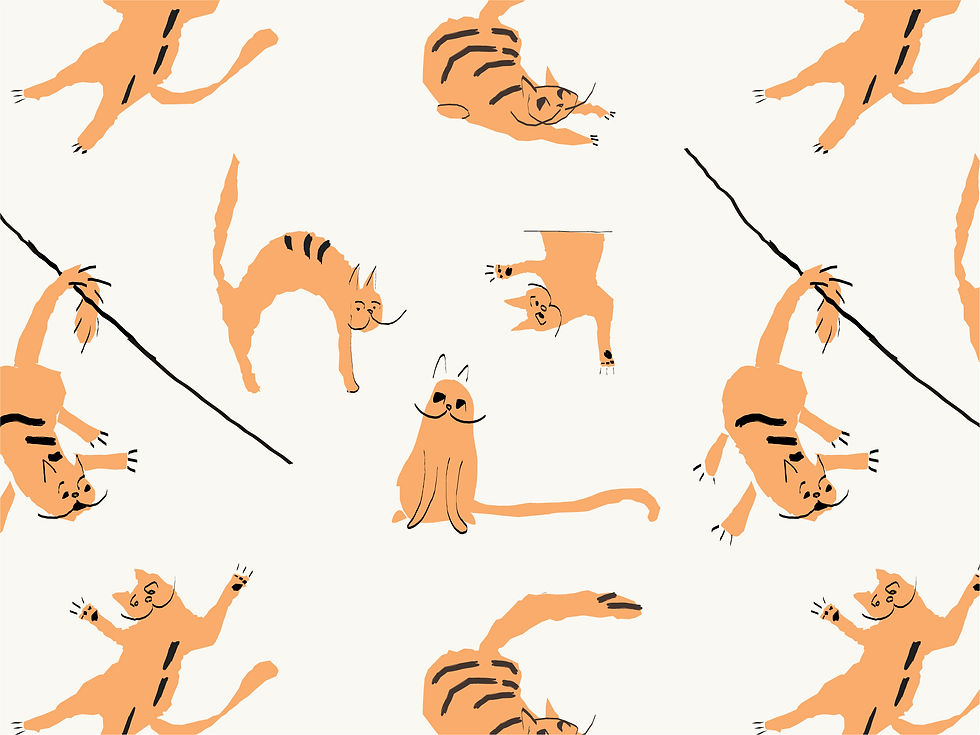
Gatto Gelato - a commercial ice cream brand
The brand focuses on creating delicious, indulgent ice cream for people who don’t care about calories but do care about great, pampering flavor. The core values and keywords: fun – indulgent – premium. The challenge was to merge these values with the leading concept: “Don’t let the cat watch the cream.”
I created the character of a greedy cat who wants to eat the ice cream. I combined it with illustrative elements and patterns, a playful color palette, and modern typography. The goal was to unify everything into a consistent visual language that conveys the brand’s values.


Kirang Haerang Regular
A bold, playful sans-serif font with raw, unfinished edges and slightly irregular stroke thickness. The uneven weight adds a sense of movement and spontaneity, while the clean yet imperfect lines give it a lively, creative, and approachable character.